What have I learnt from the process overall ?
This has been an exciting and interesting coursework allowing me to improve on my skills and really show off my existing skills.
I have made huge improvements practically, really focusing on improving what I found hard before.
I have really enjoyed this piece of work!
Group 8
Thursday, 20 January 2011
Monday, 17 January 2011
Question 4 - Whats have you learned from the audience feedback??
Above is a shot of my music videos time line. When we watched our music videos some of our feedback wasn't all positive. Our positive feedback is already up on our blogs however some people said although the video was good they felt our shots where too long. After looking back at the video I found some shots that could of been made shorter. I felt that the use of shots were okay but was limited because planning wasn't being accurate and time bound enough therefore we had to repeat a lot of shots continuously. I learned that if we were more cautious with our planning we'll be able get enough shot to spread across our music video, perhaps avoiding criticism pointing out our efforts to shadow out the lack of shot.
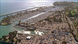
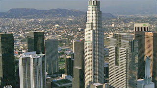 In the above video we had another student discuss what he felt was good and bad about our music video. He felt that we could of improved the amount of locations we had in our video. This is also a example that felt was very true and we could of easily improve our mise en scene planning in terms of location (setting). This is shortage of location shot was also to our lack of planning and having to rush filming at time. I learned that even if we took some well planned establishing shot of our locations at which we filmed then that will boost our marks in term of mise en scene. However because we didn't we may have of missed out on marks because had no real establishing shot of our filming locations.
Saturday, 15 January 2011
Evaluation 3) How did you use media technologies in the construction and research, planning and evaluation stages?
 When creating my digipak i used many media technologies , youtube being a popular free video sharing web site which lets users upload and share video clips helped me in my research as i was able to look at different genre's of music , which helped me to decide the best genre i was able to make a music video for. Firstly as a group we made a shorlist if potiential songs we wanted to make a music video to we came out with 'Missing You' by The Saturdays being the first one as we all liked the song, we watched the video on youtube as we tried to gather ideas together for our video as we was creating a music video for the genre of pop. As we kept watching the video we felt there was only a certain amount of things we could do for the video as it was set by a beach, we thought this was hard as we couldnt film by the beach as it was copying the video which we wasnt allowed to do and also because the lighting would be very different as it was dull and raining. After talking it over we decided to look at more music video's , we finally came up with a song called ' No Substitute Love' by Estelle , we felt this was alot easier as we all knew the song and all had possible ideas of how to shoot the video. As we was now creating a music video for the genre RnB , we was alot happier as that was the genre we mostly listen to. I was now able to look the variety of shots that was used and how they were shot. Youtube also helped me to study the artist (Estelle) as our artist 'Indiya' is heavily influenced by Estelle's style and wanted ways to show our new and up-coming artist.
When creating our music videos , we had to use a video camera, this was alot harder as in our first year we was able to use tri pods, when watching music video's i noticed alot of the shots where shot using a hand held camera. At the start i found this tricky as this was my first time filming for a long period of time without a tri pod, this began to get easier as i was filming on many days of the week. Filming by hand was easier as i had the advantages of fliming panning shots and tilts without having to turn or pick up the tri-pod.
Whenever having to film a particular scene we always had to take a still camera with us. This was important as we was needed to take photos of the location and artist, as we was creating a digipak and advertisement we needed a picture of the artist on our front cover.
When creating our rough cut for a music video, out intial idea was to use the' Green Screen' as we liked the backdrop off the ruffles of the curtain in Estelle's music video No Substitute love. Trying to create our on idea for the background we came up with the idea of using the green screen and editing the background to make it white. We wanted to add effects but couldnt find a suitable one that would fit that particualr scene. We then decided to change the background to black, we found it hard as we was unable to cut and select the artist (Yolande- the girl in the music video) onto the black background as you was able to see a green line around the body. So we decided to take it out and film it differently.
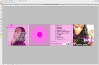
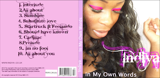
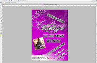 As we had to design and create a digipak and advertisement i found photohop really helped me as i was able to create a girly digipak by editng my photos that i took using the still camera , when researching digipaks on yotube i noticed most of the images of the artist are always close ups or meduim close up as it is important that the audience are able to see the artist's face. Taking that into consideration i took an extreme close up of (Indiya's) face , an used effcets such as filter, an also added make up to her eyes which i done by selecting her eyes and then using Hue Saturation to match the colour of the tile of her name. It also was useful in helping me change fonts and knowing the right fonts to use to attract my specific target audience.
 Using Final Cut Pro played a main part in my music video as this is the software which helped to put it all together. On Final Cut Pro, we was able to use effects and transitions to make our video look proffesional and effective and was able to add and delete scenes thats i needed and didnt need. It also helpes me to see various shots that i've shot but didnt yet use.It allows me too edit and cut scenes in the right places. We added transitions to our a music video one of then being a fade out , this helped alot as we wanted to come to an end but the song still had minutes left using the fade out we was able to cut the song without having to stop it abruptly.
 Anamatic
4) What have you learned from your audience feedback?
These are a few videos for our feeback on the day of our screening. After watching our video we had very positive comments back ,during the class analysis of our video we had both positive and negative feedback, one comment being "the duration of the long shot was too long" i learnt that shots in music video no matter if their long shots or close ups shouldnt be for a long period of time and only should be for a few seconds as you would cut to another shot. Another comment was "could of filmed in a differnt location". I agree with this comment as we could of filmed in a more exicting area but thought at the time it was a good area to film in as it suited our genre of music, if i had to create a music video again i would improve on the technical side, i would include alot more close up and long shots throughout video and also remember to shoot shots from different angles as it is effective as you get to the the artist from another point of view, i would also shoot an establishing shot to give the audience an idea of the genre of the music. Throughout making the video i've learnt to include a variety of shots and locations, also looking at shots for a long period of time is boring,
2)- How effective is the combination of your main product and ancillary text and advertisement
My music video and ancilary product were heavily influenced by Estelle , her style and image.
When creating my ancillary product I researched ideas for front covers , many covers relating to the RnB genre had meduim to close up images of the artist, i feel this is important as it is crucial for the target audienct it's appealing to , to able to see the artist's face clearly. I chose the colours Fushia , Black, white and Grey/Silver as i am appealing to females from the age of 17 to late 20 fushia being a very vibrant and eye catching colour makes it stand out. Using a curly font will also make it more interesting to read as a plain font looks boring.
The use of Close ups are shown throughout the video and ancillary product as it is important to always engage with the audience this is a clear visual link, as most of the shots are from long shots to close ups one of them being on the front cover of my digipak and advertisement.
Our Artist- Indiya relies on her fan base for when creating my digipak it was important that i wrote a web address as it is vital for fans to get in contact with the artistst and find out all the latest information that could include, what song she is going to record next and who she is collabrating with. This links to the advertisement as there are two web addresses (Indiyamusic) being a music site where your able to see old and latest tunes and also where your able to download her songs, here she gives her views on why she sings the songs she writes and also her reasons for writing them.
The digipak and advertisement work well together as they share similar fonts but both have the same picture on the front they also have the same design on the background showing the audince this is a clear visual link between the ancillary product.
The digipak and advertisement work well together as they share similar fonts but both have the same picture on the front they also have the same design on the background showing the audince this is a clear visual link between the ancillary product.
Friday, 14 January 2011
Question 3 How did you use media technologies in the construction and research, planning and evaluation stages?
Constructing our music video we where given state of the art video camera which was provided for us by the college. Using this we where able create a video that looked as close as possible to professional however we also used other equipment like memory cards which we used to store our shots on where we will put them on final cut pro to edit once all of our shot where collected.
In the beginning when we where planning our video and what song. We were almost forced to take advantage of site like YouTube that had millions of video of artist where we decided to use Estelle single called 'No substitute Lover'. However we as a group wasn't familiar with the British music scene and were stuck for quiet awhile on who's British and whether we thought we were able to create our own music video. It wasn't long after when we all had a epiphany in some sense as we had a storm of ideas coming from all of us all were British. Some of these ideas were: The Saturdays, Katy B, Kyla and Estelle.

When we finished bickering about what song, location of filming and when we would film. We finally finished filming and we began attempting to edit. With the use of the memory card we was able to store all our shot which we took from the memory card a put in a folder we create on a computer. From here we began 'importing' all our shots onto 'Final cut pro' where we started editing the music video. From 'Final Cut Pro' we were able to use a slow motion effect at the end of our music video which gave it a smooth ending and also it match to speed of our editing well.

When we finished bickering about what song, location of filming and when we would film. We finally finished filming and we began attempting to edit. With the use of the memory card we was able to store all our shot which we took from the memory card a put in a folder we create on a computer. From here we began 'importing' all our shots onto 'Final cut pro' where we started editing the music video. From 'Final Cut Pro' we were able to use a slow motion effect at the end of our music video which gave it a smooth ending and also it match to speed of our editing well.
Using "Photoshop and Quark" we were able to construct our ancillary products. However me personally didn't use Quark but was taught how to just in case. Using photoshop we was allowed to take picture we took during filming ect, and put them onto the digipaks panels to create the covers of our digipaks. At our Photoshop tutorial we was told how to use the 'Magic Wand' looking icon to cut around picture and 'Inverse' them so we didn't get the backgroud part of a picture which we never wanted to use. I felt this was the most important tool I used on photoshop.
My font was found in photo-shop however when constructing my Digipak i used a website called www.cooltext.com where I looked for some new and fresh fonts. In the end i decided that i'll use a simple font that went well with the artist name. our artist was called 'Indiya', kind of like indie. So I thought I use a indie font and after doing some research I found out that there are quite a few indie album covers with similar font styles. Using the photo-shop we were able to change the color of our text, in my case a shade of purple as the fushia my planned font color wasn't on photo-shop.
Analysis of three digipaks that relate to my genre
This digipak is simialr to mine as we used only three colours, but made them contrast against each other this digipak relates to the RnB genre as it is very urban and it has a picture of Keri Hilson on the front smoking given eye contact the image is in grey but her eyes are high lighted making ther eyes stand out. The police borders saying ( no boys allowed) suggest that she has specifically made the album for girls only.
The colour scheme for this digipak is the same as colours i used for my digipak , the body language in her pictures show attitude, the large pink font is bright as it contrasts against the grey backgroung making it bold and eye-catching
The style of this digipak is simple but effective, this relates to the RnB genres as her name is bold and stands out but also the bright coloured snake suggest nothing can touch her as the RnB industry is all about competition her body language and facial expression also suggest attitude.
Subscribe to:
Comments (Atom)


