Showing posts with label Parris Bolmin. Show all posts

Saturday, 15 January 2011

Evaluation 3) How did you use media technologies in the construction and research, planning and evaluation stages?

When creating my digipak i used many media technologies , youtube being a popular free video sharing web site which lets users upload and share video clips helped me in my research as i was able to look at different genre's of music ,  which helped me to decide the best genre i was able to make a music video for. Firstly as a group we made a shorlist if potiential songs we wanted to make a music video to we came out with 'Missing You' by The Saturdays being the first one as we all liked the song, we watched the video on youtube as we tried to gather ideas together for our video as we was creating a music video for the genre of pop. As we kept watching the video we felt there was only a certain amount of things we could do for the video as it was set by a beach, we thought this was hard as we couldnt film by the beach as it was copying the video which we wasnt allowed to do and also because the lighting would be very different as it was dull and raining. After talking it over we decided to look at more  music video's , we finally came up with a song called ' No Substitute Love' by Estelle , we felt this was alot easier as we all knew the song and all had possible ideas of how to shoot the video. As we was now creating a music video for the genre RnB , we was alot happier as that was the genre we mostly listen to. I was now able to look the variety of shots that was used and how they were shot. Youtube also helped me to study the artist (Estelle) as our artist 'Indiya' is heavily influenced by Estelle's style and wanted ways to show our new and up-coming artist.
When creating our music videos , we had to use a video camera, this was alot harder as in our first year we was able to use tri pods, when watching music video's i noticed alot of the shots where shot using a hand held camera. At the start i found this tricky as this was my first time filming for a long period of time without a tri pod, this began to get easier as i was filming on many days of the week. Filming by hand was easier as i had the advantages of fliming panning shots and tilts without having to turn or pick up the tri-pod.


Whenever having to film a particular scene we always had to take a still camera with us. This was important as we was needed to take photos of the location and artist, as we was creating a digipak and advertisement we needed a picture of the artist on our front cover.


When creating our rough cut for a music video, out intial idea was to use the' Green Screen' as we liked the backdrop off the ruffles of the curtain in Estelle's music video No Substitute love. Trying to create our on idea for the background we came up with the idea of using the green screen and editing the background to make it white. We wanted to add effects but couldnt find a suitable one that would fit that particualr scene. We then decided to change the background to black, we found it hard as we was unable to cut and select the artist (Yolande- the girl in the music video) onto the black background as you was able to see a green line around the body. So we decided to take it out and film it differently.


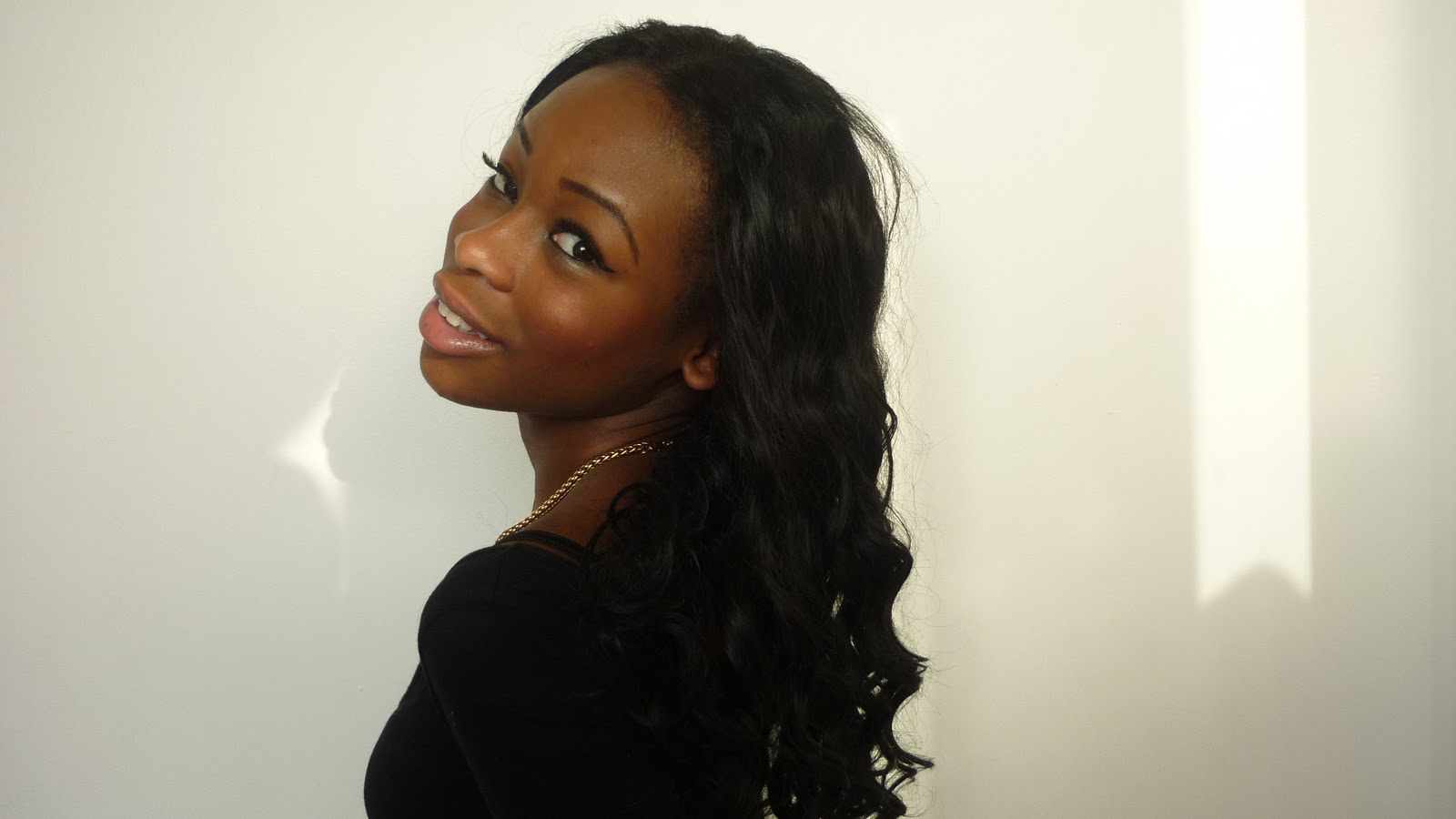
As we had to design and create a digipak and advertisement i found photohop really helped me as i was able to create a girly digipak by editng my photos that i took using the still camera , when researching digipaks on yotube i noticed most of the images of the artist are always close ups or meduim close up as it is important that the audience are able to see the artist's face. Taking that into consideration i took an extreme close up of (Indiya's) face , an used effcets such as filter, an also added make up to her eyes which i done by selecting her eyes and then using Hue Saturation to match the colour of the tile of her name. It also was useful in helping me change fonts and knowing the right fonts to  use to attract my specific target audience.


Using Final Cut Pro played a main part in my music video as this is the software which helped to put it all together. On Final Cut Pro, we was able to use effects and transitions to make our video look proffesional and effective and was able to add and delete scenes thats i needed and didnt need. It also helpes me to see various shots that i've shot but didnt yet use.It allows me too edit and cut scenes in the right places. We added transitions to our a music video one of then being a fade out , this helped alot as we wanted to come to an end but the song still had minutes left using the fade out we was able to cut the song without having to stop it abruptly.

Blogger  helped to me blog everystep of making the music video from planning what song to make a music video for to the last stages of finishing my digipak and advertisement. It also shows the procedure that we went through as a group in order to make this music video and ancillary product.
Anamatic

4) What have you learned from your audience feedback?

These are a few videos for our feeback on the day of our screening. After watching our video we had very positive comments back ,during the class analysis of our video we had both positive and negative feedback, one comment being "the duration of the long shot was too long" i learnt that shots in music video no matter if their long shots or close ups shouldnt be for a long period of time and only should be for a few seconds as you would cut to another shot. Another comment was "could of filmed in a differnt location". I agree with this comment as we could of filmed in a more exicting area but thought at the time it was a good area to film in as it suited our genre of music, if i had to create a music video again i would improve on the technical side, i would include alot more close up and long shots throughout video and also remember to shoot shots from different angles as it is effective as you get to the the artist from another point of view, i would also shoot an establishing shot to give the audience an idea of the genre of the music. Throughout making the video i've learnt to include a variety of shots and locations, also looking at shots for a long period of time is boring,


2)- How effective is the combination of your main product and ancillary text and advertisement

My music video and ancilary product were heavily influenced by Estelle , her style and image.
When creating my ancillary product I researched ideas for front covers , many covers relating to the RnB genre had meduim to close up images of the artist, i feel this is important as it is crucial for the target audienct it's appealing to , to able to see the artist's face clearly. I chose the colours Fushia , Black, white and Grey/Silver as i am appealing to females from the age of 17 to late 20 fushia being a very vibrant and eye catching colour makes it stand out. Using a curly font will also make it more interesting to read as a plain font looks boring.
The use of Close ups are shown throughout the video and ancillary product as it is important to always engage with the audience this  is a clear visual link, as most of the shots are from long shots to close ups one of them being on the front cover of my digipak and advertisement.
Our Artist- Indiya relies on her fan base for when creating my digipak it was important that i wrote a web address as it is vital for fans to get in contact with the artistst and find out all the latest information that could  include, what song she is going to record next and who she is collabrating with. This links to the advertisement as there are two web addresses (Indiyamusic) being a music site where your able to see old and latest tunes and also where your able to download her songs, here she gives her views on why she sings the songs she writes and also her reasons for writing them.

The digipak and advertisement work well together as they share similar fonts but both have the same picture on the front they also have the same design on the background showing the audince this is a clear visual link between the ancillary product.


Friday, 14 January 2011

Analysis of three digipaks that relate to my genre

This digipak is simialr to mine as we used only three colours, but made them contrast against each other this digipak relates to the RnB genre as it is very urban and it has a picture of Keri Hilson on the front smoking given eye contact the image is in grey but her eyes are high lighted making ther eyes stand out. The police borders saying ( no boys allowed) suggest that she has specifically made the album for girls only.
The colour scheme for this digipak is the same as colours i used for my digipak , the body language in her pictures show attitude, the large pink font is bright as it contrasts against the grey backgroung making it bold and eye-catching
The style of this digipak is simple but effective, this relates to the RnB genres as her name is bold and stands out but also the bright coloured snake suggest nothing can touch her as the RnB industry is all about competition her body language and facial expression also suggest attitude.

Photos used in my digipak


Thursday, 13 January 2011

Evaluation-1) In what ways does your media product use, develop or challenge forms and conventions of real media products?

When planing to make my music video , i was influenced by many artists one of them being Estelle, as she is an RnB /pop artist who was oringally from the UK who wrote and sang songs who then moved to America to persue her dream of becoming a music artist, she now is a well known RnB artist who has collabrated with many other famous artists.
 She is a positive role model for young female adults her lyrics talk about her lifestyle of when she was growing up and also the controversial issue of  love. Our artist Indiya was influenced by Estelle we wanted to follow the convential style of a new upcoming RnB artist who posts song on facebook of her singing songs she wrote.


The use of editing and visual style influenced me, as their was a variety of camera shots, their were many close ups of her face and her lips which i though was effective as there is a connection with the audience , their were also many long shots and meduim close ups of her and Sean Paul another artist who featured in the song. Although the editing is quite slow paced their are many cuts , i liked the transition of the meduim close of Estelle and Sean Paul as it then faded to seeing a close up ofEstelle in front of the green screen which they edited to make it red . As a group our intial idea was to use the green screen as we wanted a white background so we can add effectes, but decided to take it out as we didnt sing the song all the way through and only sang the chrous for that particular scene. The long shot of her on the bed is effective as you see her from a different poin of view as a group we tried to incorprate thats into our video aswell.


 I looked at many music videos and how this particual genre was shot, my video was targeted at young adults from the age of 18 to late 20's, them being females as my digipak and advert are in the colour pink. I chose the particular colours of Fushia, White, black and Silver/grey as i thought these colours would definately appeal to girls .


In this picture Estelle is shown in a close up dancing with Sean Paul we thought this was a good shot as we was following a narrative we thought that it was important to see the relation between the girl and boy so the audience can realte.
This is a long shot of Indiya as we wanted to shoot a variety of shots we decided to do a pan this was very effective as we not only got to see the whole artist but also the backgrond and scenary behind her. When coming to the end of our video we thought as a group we should add one more transition in before the end and decided to slow down the ending as she is walking as we faded out the song. This is examples of using conventions that have been previously used.

Analysis of three advertisements that relate to my genre

This is an advertisement of an RnB artist called Ciara, the structure of the advert is similar to mine as we have simialr fonts for the imformation. In this advert her top the boarder and her name in capital letters are all in the colour red this is the same as mine whereas i have used the colour pink. The clothing that she is wearing relates to a rnb genre as many rnb artists wear alot of hooded tops and baggy jeans.

Gwen Stefani a american RnB/Pop artsist , this advertisemnent relates to the genre as the large curly font , as it is eye catching and appealing the goldish yellow colour is used for the font and also the background making her name stand out against he white, the image of herself looks painted, Gwen's style is quite unusual she likes to use lots of contrasting colours with big fonts and images , this in similar to the rnb genre as they normally have a big image of themselves on the front as other genres wouldnt necessarly have an image of themselve but of somthing else.
This is an advertisement of an american RnB/ Hip Hop american artsist , by looking at the way she dresses you can immediately tell she is an RnB artist as they tend to wear alot of black and also have alot of chains hanging from their neck and big hoop earings. her body language also suggest attitude this is a common feature in many RnB advertisements as their all competing to be number one. The advert is appealing to girls and boys, as she is showing alot of her torso.

Wednesday, 5 January 2011

Overview of Do's and Don't' of design work

Writing has to be clear and eligable
Not to use to many images , keep it quite plain and simple but effective
To use only three colours as more will make it confusing and will make it hard to see what target audience your appealing to
Taking pictures of people or locations thats are relavant to your digipak or advert
To keep the same font for the title of the album and song lists as different fonts for different things make it hard to read.
To use the same colours within the group that where discussed

Short lists of fonts , colours, layout and design

As a group we sat down and decided the colours for our advert will consist of Fushia, Black, White and the other colour being of our choice , we chose these colours as we are appealing to a certain target audience of 17 to late 20's , we chose the basic colours such as black and white as they are contrasting colours and make images and font bold and effective. For my digipak my font for the title of her name was curly and fancy, as im appealing to quite a girly audience and now going to interpret that into my advert, as i group we using simple fonts such as Hand writing, Arial and Times new roman for the writing of the advert and song lists as the writng has to be clear and eligable to read , the layout will be quite plain but effective as it will have a flowery curly pattern in the backgroung which will be faded out with my colour choice of silver for the writing, the border around it consists of silver and all the  colours will be contrasting, make it bright and bold.

Analysis of at least one sequence

The first sequence is of yolande in the park beside a tree as it then changes to a close up of her in the green room then back to the park during this time we didnt sing the whole song all the way through and only sung certain parts of the song meaning the chrous wasnt broke up into different location, after our teacher viewed our rough cut ,she told us we had to change this as this didnt happened in music videos , and only it would happen if we was following the theme of disjuncture but we wasnt .

Feedback from the rough cut

Wednesday, 8 December 2010

Analysis of three Digipaks

Adele Laurie Blue Adkins born 5 May 1988, known professionally as Adele is an English singer songwriter. She was the first recipient of the BRIT Awards Critics' Choice and was named the number-one predicted breakthrough act of 2008 in an annual BBC poll of music critics, Sound of 2008. She is a multi-Grammy Awards nominee who has won two awards, Best New Artist and Best Female Pop Vocal Performance in 2009.
The front of her digipak is quite basic as it it a picture of her face , she used two colours them being black and white this is effective as the white contrasts against the black background making the font of the title (her name) stand out. This is simialr to the digipak i want to create as i want to keep it quite basic but effective as she has done here.


Robyn Rihanna Fenty born February 20, 1988, better known as simply Rihanna , is a Barbadian R&B recording artist and songwriter. Born in Saint Michael, Barbados, Rihanna moved to the United States at the age of 16 to pursue a recording career under the guidance of record producer Evan Rogers. She subsequently signed a contract with Def Jam Recordings after auditioning for then-label head Jay-Z.
On this digipak there are 2 images of Rhianna , a full image of her and a meduim close up . At the bottom there are three different images of her , this is effective as it shows the albums she has done already. This didgipak gives me an idea as  for the middle of my digipak i wanted to have a similar image to the one on here of a full length image surrounded by acknowledgements . I also like the meduim to close up image of her as their is no writing but simply her posing.

                                                      
In this didgipak , it uses a number of colours but in the middle keeps the same theme running through, the front and back however use to differnt colour schemes the front cover is a mix of orange, blue, yellow and black and the back cover is just blue. The half image of Braden is plain but contrasts as he is wearing white against the blue also the colour used on the font also stands out.


Monday, 29 November 2010

Postive and Negative feedback

After getting together all our shots , we started to edit them on final cut pro, whilst doing that we reaslised we didnt have enough shots, we also didnt sing the whole song all the way through and also sang parts of the song leaving us with very few camera shots. When putting them on the time line we started of with scenes in the park then moved to the green screen then back again, when are teacher came to view our video she said this wasnt a good idea as in every video whilst singing a chrous it dosent cut to another scene. Looking back on this we then reaslised that we had to film more shots using that advise that we were given . We where also told to bring in Feelando earlier in the video as it would be confusing if you were just to see him towards the end although the lyrics tell the story. As we had a lot of editing to do because we thought it would be better to start again. After gathering all our shots for the second time we found out that it was alot easier as it started to come along. We then started to put it onto a timeline and added transitions, once our teacher looked at it for a second time , the feedback she gave was positive.

Tuesday, 23 November 2010

Finished video


This is our finished video and we are very proud of what we have acomplished as in the beggining we thought that we would not get it done and that everything would be done last minuit, but in reality all we had to do was film more and stay focused to get this video finished as the due day was round the corner. We had gone through a lot of challenges to get this video of how we wanted it, at first the video had no meaning to the song itself and we felt as if the shots had been placed in any order, but we went to lunch time workshops to get the full oppotunity as the completing the video was important to us. We sat done and watch the rought cut to see what didnt work and what we could keep, by doing this we also had to go back to the shots that we had filmed to see what options we still had as there was no time for filming, bit by bit we placed the possible shots down the time line to see they worked, if they didnt we would delete it and find another alternative. We are particularly happy with the whole video, the editing, shots and mise en scene. We worked really hard to get the lypsynch precisely, also we tried to put different effects to add emphasis

Thursday, 18 November 2010

Rough Cut Video

Our Rough Cut is a slight preview of how our intial music video is going to look.It gives a brief outline of some of the mise en scene, shots and location that was filmed.
our techer had given us a lot of feed back about our un finished video. At first we were not really happy about what she had told us about the shots and how we needed to change it, but as we watch the video back we realised that at this point criticism was vital as we needed the video to be at its best.
She had told us that on the chorus the clip was left too long  and that we had to some how cut it down or add a new clip. We where told that this rough cut had not made sense we placed different shots with different locations to different parts of the song so there was no structure to our video. when she told us this, we were quite upset as we thought we didnt have that much shots to even transform the video, at this point we had to act quickly as the due date was round the corner. Another criticism we had about this rough cut, was the representation of of the Black male in the hoody, we thought about it and we came to a conclusion that we had to change it because it was a cliche. We noticed that the order of the video we had put together was not according to our story board which was a problem because it meant that we did the video from the top of our heads, all we had to do was change around the shots and make it similar to the story board. As a group we decided that we had to do more filming sessions to make the video complete.

Pitch


The pitch contains our groups initial ideas for our music video, I chosen song was 'No Substitute love' by Estelle, we chose this song as we thought we could film a varirty of shots for it as it would make a good music video. Our target audience is 17-25, as we thought teenagers and adults would be able to relate to the lyrics of the song.
 It shows our locations. Where and what time we will be filming on what days of the week.
What type of shots will be needed e.g medium shots , close ups. and what shots will be used for each scene, it also contains our concept , which our group chose to follow the theme of disjuncture as it dosent tell a story. Our idea was to film a walk through for each scene. At the end of each scene we would film a shot and then film a high angled shot then bring the camera down into a new location. It also states who we think would us.


Tuesday, 16 November 2010

Filming Photos!!

This is a photo of Parris filming me and feelando as we do the shot when we are walking down.

This is a shot to show how in this group we work together and we take turns tofilm as we feel the eqaul opportunity allows us to reach ou full potential with our filming.


A shot of yoland ewhile she is singing to show the reality of the video as she is singing along to the song playing in the background.

A very cold day but we braved the cold and tried to feel comfortable with what we had. A very natural picture of again parris filming Yolande whilst doing the panning shot.


These are some of the photos we took whilst filming, many of the photos will be used for our digipak ..
We took shots of the location, as this will be seen in the background in many of the scenes in the music video.