Question 1
In what ways does your media product use, develop or challenge forms and conventions of real media products?At first we had no idea what song we wanted to choose as we had so many to choose from it was also hard because we thought that if we had a choice to choose and American song it would be much easier as we would have a wider selection. But unfortunately we didn't so it was down to the British scene. I didn't know a lot British singers myself so i had to do my research through Google and look for artists. Now British songs consists of all of the genres so we had to be specific while choosing. We came across a shortlist of songs : Katy B, The Saturdays,Kyla and Estelle etc. They are only women artists because we decided that i would be the main artist and if it was a group the girls in my group would be involved. We then made a decision of what song we would choose and decided it would be Estelle- No Substitute Lover the genre of R&B.
The video i would say that influenced me in my decision to make my video as the conventions used in the video above are similar to the conventions in ours. The story line for the video 'Miss me' describes a woman who was ln love with a guy and then decides to leave him as he is doing no good behind her back. Similarly the storyline behind 'Substitute lover' which is the song to our video is about a woman who likes a guy but decides to leave him as she doesn't want to be his substitute lover. We didn't totally copy the entire video, but certain aspects of the video influenced us, in terms of its visual style and camerawork.


To your left i took a screen shot of part of our video that shows a flash back of the artist with her ex boyfriend, it shows them having a good a time, the fact that they are close together shows their closeness. We added a transition fade to show that it is a flashback and shows that the artist is thinking back.
In the screen shot under ours shows the similar type of shot used in our video, Which again shows the couple talking and also enjoying each others company.So from this video we incorporated the fact they used a flash black to show what they had in the past. The only difference is the fact that they didn't use a transition and most of their flash back are used in the beginning of the the video.


In this screen shot shows it shows a medium shot of the artist here self singing directly to the camera as though she is talking to the audience by involving them and telling them a story by indirectly. This shot is particularly good because you can see her attitude towards who she is talking about and how she feels.
This shot too shows the artist singing and saying her story to the camera which is also a indirect to who she is talking about. This medium shot also shows her emotion and shows she can be happy with or without him.

I have noticed that throughout the 'Miss me' Video it seems to in sepia and black and white which creates a less modern look whereas in in my video it is in color.
We decided that we would make our video totally different to the original video and how it was originally made as we wanted to be different. In the original video Estelle looked as if she was happy that she had finally got rid of him, whereas in my video she seems angry but relieved that she has let go of him. I would say that our video does break with the genre conventions in quite a few ways as our video was budget and did not receive any money to help with the production. We did not have a studio shots to establish our video, although through our filming we went to the studio in our college which had a green screen, the green screen would be used to cut out the background and use another, our first initial idea was to use it and have a plain white background to create that studio look, we then scraped that idea made it black and put it in our rough cut of the video, this looked very effective because it was plain and you could focus only on the artist, Eventually we scraped the whole green screen shots because we didn't think it was convenient to have them.
It broke another genre convention because we didn't have all the glamorous costumes that a typical R&B singer would have for instance while our artist was wearing jeans and a coat, other artists would be wearing dresses and fashionable clothing.
I think our video was quite effect because of all the editing and shots it consisted, The shots i loved was the panning shot as the artist was singing, this shows our ability to hold the camera stable and film what we want, it also creates effect as if the world was moving around fast, i think that worked very well. As well as the panning shots, i also loved the tracking shot when the camera is walking with her, it makes it seem as though we are walking with her through out her journey. At the beginning there are shots of her and her friends having fun walking through the park, i decided to add this in to show her happiness in the beginning, i cut it in a way so that the cuts where done according to the beat, these ended up being quick shots as the beginning of the song was quick as well.
In terms of editing at the end of our video we decided that would put a slow motion edit as a signing of to our audience. I would say that it was really effective because it showed her having fun with not a care in the world which sends of a good message at the end. As i mentioned earlier we also edited our video to have transition shots of flashbacks of the character which i also think was quite effective.
Question 2 How effective is the combination of your main product (video) and ancillary texts (digipak and advertisement)?

The Influence for my digipak came from the above front covers for the artists. As you can see the colors used constist of Black,Fuchsia and white which we absolutely loved the fact of using as these colors really stood out to us, the contrasting colors white brings out the image it self. The central image is black which gives the cover an old look but at the same time shows the natural beauty of the artist and that is what we want to see. The Front covers up above are very distinctive and would attract the audiences eye.


 In terms of the advertisement i decided that i would use the same image as i did for the front cover of my digipak as we are only reflecting on the CD that we are trying to promote, The image of the artist i edited so that it could have a spray of fuchsia, so the picture reflect on the whole theme of the Digipak and advertisement. The CD cover is places right in the middle so that others are able to see what the CD looks like so that they can go and purchase it. Throughout the Digipak and advertisement i tried to keep the same pattern going through in terms of Font, now the font is eye-catching and is bold, it fits in with all its conventions of a typical woman audience with its curly corners and colors that come out.
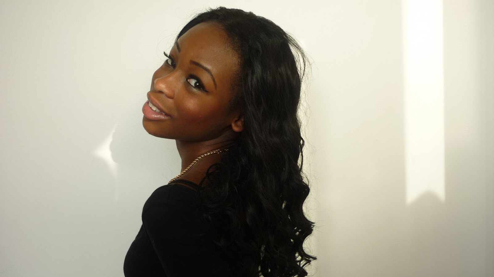
I would also say that my digipak does link to my video because it shows the artist 'Indiya' being happy and showing that she is free, in comparison to my video it also shows that she want to let go, so the images on the digipak shows how she has finally done so. The picture of the artist too shows her looking quite the same the way she did in the video so when people see the video they would then be able to go to the shops ,recognise her and buy her CD as they really liked what they saw and heard on the video.
I think that all of the print work, work together as the images, colors and fonts have similarities and all link, i think that it is good because as soon as everybody sees it they will know that it is for one artist only.
Question 3 How did you use media technologies in the construction and research, planning and evaluation stages?
Before we had any idea of how our media video would be made, we had to of course do our research of ex student movies through Vimeo and other student from different colleges via Google, we also went home to look for professional videos, although we knew we would have the equipment to make the type of videos we see on t, we would have and idea of how to make it close to professional looking. Looking at these videos really enhanced our ideas and made us think about how we were going to film, choreograph and edit our video as we wanted it to be the top.
Through our lip sync tutorials we got an insight as to how we could get the song and the footage we have to be in sync together so that it will look as if we are singing. This was really useful as we needed to get the syncing on point as it would look messed up and not professional at all if we hadn't. The camera effects was also taught to us as it would be vital as we might need it in our video.

To film our footage we needed a brand new state of the art video camera. It was important that we used these cameras as it took really good footage that came out nice on the computer and gave it the professional look. This camera enabled to do many shots and to view a clearer picture than how you would see it if you were to film it on your phone or a smaller device. We were also able to view what we had shot in the little screen that it had with it, if we didn't like the shot we were able to redo it and improve it.

When using the cameras we had to make sure that we used the memory card correctly because if we had not used it correctly, everything that we had filmed would be lost and we would have been really upset about that as we would have filmed so much. The memory had a large storage round about 16GB which would allow us to film a variety of shots and even if we had not liked the shot we could still keep it on the memory card to view it later and use certain parts of the video we liked from what we didn't like and combine it, which is what had happened to us.



I am very happy to say that i played a lot of the part of editing our video on a program used on the iMAC called 'final cut pro'. I wouldn't say that it was hard as we used the same program in the year before during AS, but it was quite complicated as i had to get the video to sync with the footage that we had filmed.
 On the iMACs there wasnt a wide range of fonts that we were able to use to make the digipak more effective and look attractive, so i decided to go on a website and download a particular type of font to help bring out the artists name. So i chose a font called 'Angelic War' which i think went with the conventions of a R&B singer.
 To produce our digipaks we had to use programs called 'Photoshop Elements' and 'QaurkXPress', we had a choice as to what program we wanted to used so i chose to use Photoshop Elements as i was more familiar with it than i was Qaurk although we were all taught how to use both of the programs. To your left you can see the editing process i had to go through to make my final product which was what i was proud of. With photoshop elements i was able to change the way a certain picture looked, The front image did not originally have a black and white effect and so i changed it with one of the tools.
As you can see on a few of the images i decided that i would change it to a colour that would fit in with the digipak which is fuchsia, i think it really does show the girly side of the artist herself.

Photoshop Elements allowed me to be creative with what i wanted to do with my work, exlporing through all the tools it had gave me a chance to find out what i couldnt do before for example putting shapes to make it spread across the digipak, or changing the background and cutting around the images to change the background of the picture. I really had fun with playing about because it really allowed me to do the work the best of my ability.

Here you can see my process through the producing the advertisment. Here you can see the main picture black and white but in the final product there is a pink blur on top of the picture which i think works particulary well.
 Another program we used as i mentioned earlier was called Final cut pro, this allowed us to do all of our editing. As you can see from the screen shot on the right hand side you will be able to see how we edited the videos. On the top left hand corner you will be able to see the footage that we had filmed, with the footage there we were then able to drag them on to the time line and put them were we wanted. But before all of that we had to put the actual song at the bottom of the time line and lock it, so that it would not move and so that it was easier to line the footage with the song. We then had to look through the shots that we filmed and chose specific ones so that we could mark what lyric we want on the footage and align it with the actual MP3, this way the song would be in sync with video to make it look like we were singing it. 'Final cut pro' allowed us to explore too what it had for example the transitions that we could put, as a group we went through every transition and chose what one we wanted to put in. Also although we didn't use change the color of any shots in terms of editing, we found that we was able to change our footage what ever color we wanted like sepia, black and white, pink, orange what ever we wanted. I would say 'Fina cut pro' is a good way to edit videos because although it takes time to get used o, you also get comfortable with the way of using it, it wasn't too complicated.
Question 4 What have you learned from your audience feedback?
Alhtough i was nervous when our video came out, I would say that we got a pretty good reaction from the audience when we was watching it in the cinema, when i was looking around i could see everybodies eyes glued to the screen, i felt very proud of our work when everyone started clapping because you could tell that everyone enjoyed it, because i was the main person in the video, as we came out of the cinema people came up to me and telling me i was good which had really made me smile.As well as good feed we also recieved negative feed back from the class when we viewed our video one more time they said that we needed more locations as we literally only had 3 loactions in our video, the lighting in the third verse; they said that i was a bit bright, and that we should have focused on the camera work like the stillness of the camera as it was a bit shaky in the beginning, but in my opinion i think that worked quite well because it created a realistic look for me.
In terms of the negative feed back that we had recieved i agree with the fact that we should have had more locations as it would have made the video much more interesting, also the fact that it was a bit shaky looked alright for me but we could have used a tripod to make it look more still.
On the day of our viewing we thought that it would be a good idea to go and ask people what they thought about our final product being our music video, we recieved a lot of good feed back these are a couple of the few video we have film.